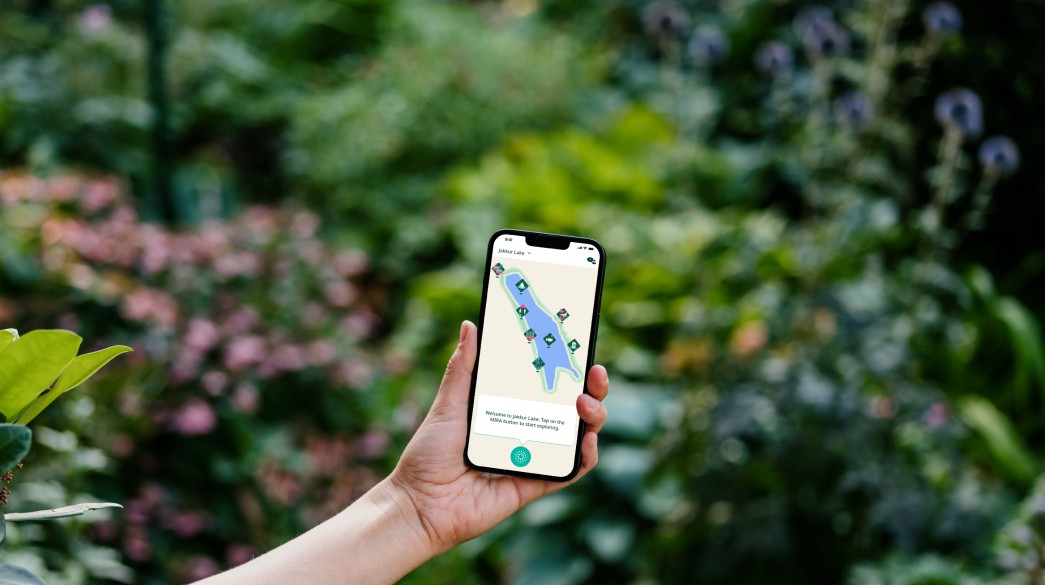
Bengaluru once had around 280 lakes. About 80 remain. Citizen groups hold the data and the stories that explain what is left, but none of it reached someone standing at the water. Mira turns a lake visit into an active learning experience.
An extension of the Bangalore Citizen Lakes initiative, led by CSEI, ATREE, Biome and Friends of Lakes with support from Akamai and Oracle. Its beta platform already tracked ecological parameters with community help. I led the design for eight months, from discovery and information architecture through interaction and visual design, testing and handoff. Illustration, the sensor deployment and the backend sat with others on the programme.
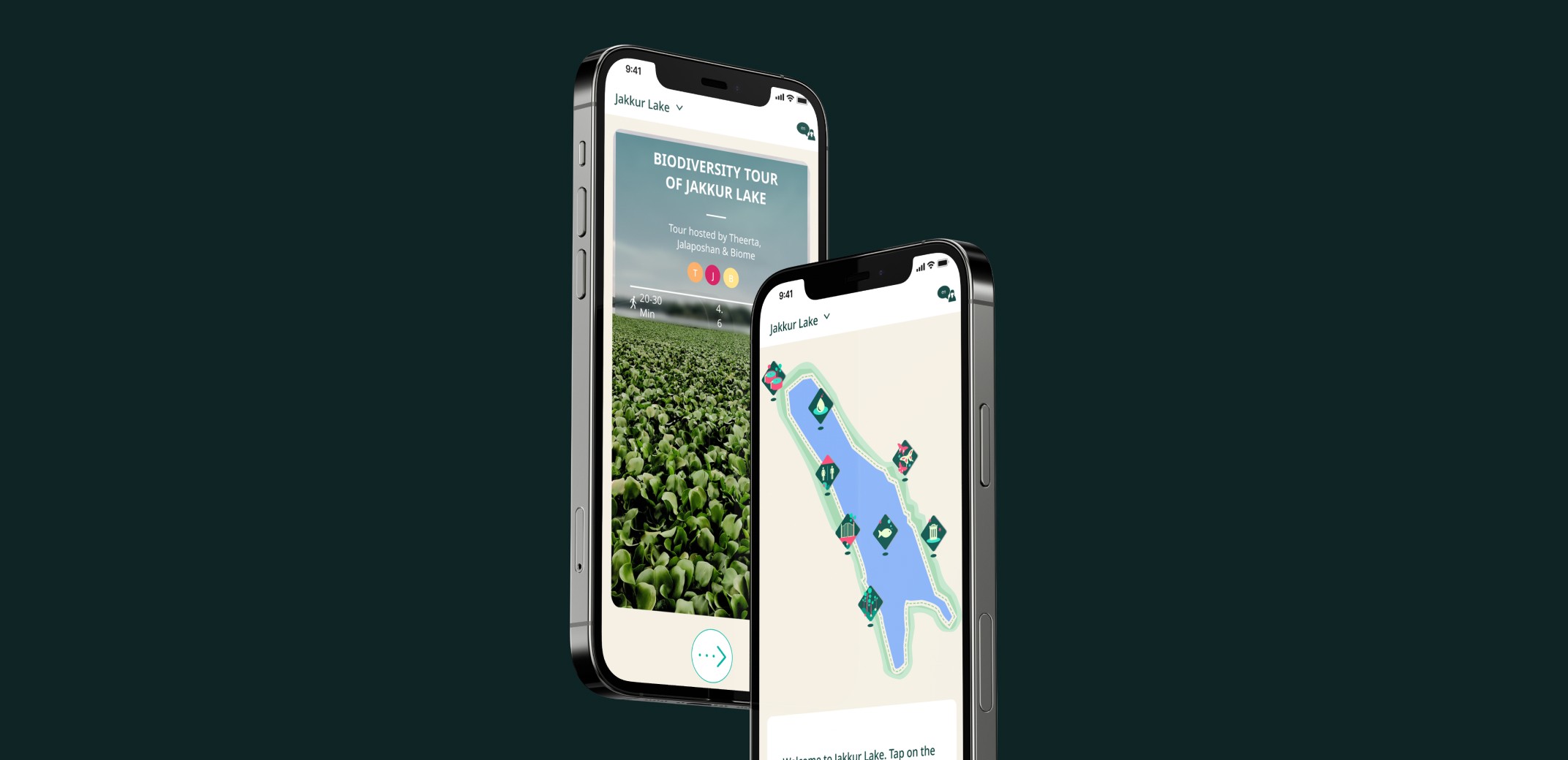
The first thing to understand was the place. Across Jakkur, Kaikondrahalli and Haralur, the information around the lakes was fragmented, old, or too thin to explain what you were looking at. A board reading “conservation zone” named the thing without saying why it mattered, and people walked straight past it.
Site visits ran alongside stakeholder sessions with the citizen lake groups. Researchers brought the ecological data; the groups pointed to the locations and milestones worth building a tour around.
We had assumed the gap was access, that putting the information in people's hands would be enough. It was not. People wanted the story behind what they were looking at, and a way to take part rather than only read. That turned Mira from a reference app into a guided one.

The same three people kept turning up: someone walking for the calm of it, someone already volunteering at weekends, and someone responsible for the lake's health.
Built from the stakeholder sessions and on-site research. They represent recurring user patterns we saw across the lake communities and visits, rather than invented individuals.

Anaya
Anaya lives near Jakkur lake and often walks there in the mornings. She enjoys the calm environment and likes spotting birds, but isn't aware of the lake's ecological importance.
- Relax, unwind, and enjoy nature
- Learn interesting facts about the lake
- Feel connected to her neighbourhood
- Unsure of the lake's timings and amenities
- No easy way to discover meaningful information while visiting

Ravi
Ravi has been part of his local lake group for a few years. He organises clean-up and plogging drives.
- Contribute to improving his neighbourhood
- Be part of community-led initiatives
- See tangible results from collective efforts
- Limited access to data on lake health
- Lacks structured ways to coordinate volunteer efforts

Meera
Meera has been deeply involved in lake conservation for over a decade. She collaborates with civic agencies, attends policy meetings, and mentors local volunteers.
- Ensure the long-term ecological health of the lake
- Advocate for better policies and maintenance
- Educate others about environmental science
- Difficulty accessing reliable data
- Bridging the gap between community knowledge and policy decisions
Three different people walk through the same lake, but there was only going to be one experience. The challenge was to turn different needs, local knowledge and ecological data into a simple set of experiences people could use while they were there.
The architecture follows the sequence a visitor actually moves through: pick a lake, pick a tour, walk it, read the water. Everything sits on that path. It is what keeps a bilingual app with sensor data behind it from collapsing into a menu.
The four are lake selection, guided tours, lake data and language. Nothing else made the MVP.
Four conditions shaped this design more than any preference did. Some came from the setting, some from the realities of building an MVP.
-
Used while walking, outdoors
Screens are read in glances, one-handed, in direct sun. Everything load-bearing had to survive a two-second look, which is why navigation is icons and the assistant sits in thumb reach.
-
One codebase, both platforms
Built in Flutter so it ran on Android and iOS from a single build. Reach mattered more than platform polish: whoever turned up at the lake had to be able to install it.
-
Two scripts, one layout
Kannada and English had to occupy the same screens without a separate design. Every layout was built against the longer of the two.
-
Nothing to redesign
There was no earlier app or information architecture to work from. The starting point was analogue: signage, display boards, the lake itself, and what the citizen groups already knew.
Those pieces became four core areas: lake selection, guided tours, lake data and language. Nothing else made it in.
One feature that did not make the MVP was volunteer event coordination. With a small team and limited time, the priority was to make the core lake-learning experience work well before expanding its scope.
-
A first-time visitor completes a tour unaided
MeasuredFrom in-app tour completion events.
-
Water-quality data is understood, not just displayed
MeasuredIn testing: can a visitor say what the reading means for the lake after seeing the card?
-
A steward can publish a tour without us
MeasuredBy watching one do it, start to finish, in a single session.
- Pick the lake.
- Browse the available tours and select a preferred one.
- Understand the rules of the lake.
- Onboard for the tour and its functions.
- Start walking toward the first milestone.
- Check the map to stay on the right path.
- Spot the trees highlighted in the app.
- Get detailed information on each tree.
- Unlock the milestone with a congratulations screen.
- Start walking toward the next milestone.
- Options of different tours help the user pick a preferred one.
- Rating and duration help set expectations for length.
- Overwhelmed by the information overload.
- Happy to reach the first milestone.
- Amazed by the flora and fauna at the spot.
- Surprised to be able to spot some of the trees.
- Happy to learn something new about their local lake.
- Enthusiastic to see what the next milestone is.
Designing a guide for the lake
With the architecture settled, the question became what it should look and feel like. Three decisions did most of the work: icons instead of labels, so one screen serves both scripts; milestones placed on real ground rather than spaced on a map; and water-quality readings rewritten as plain cards.
Before any screen, the ground rules. I worked these out alongside the illustrator handling the object artwork, so the interface and the drawings would come from the same place rather than meeting awkwardly later.
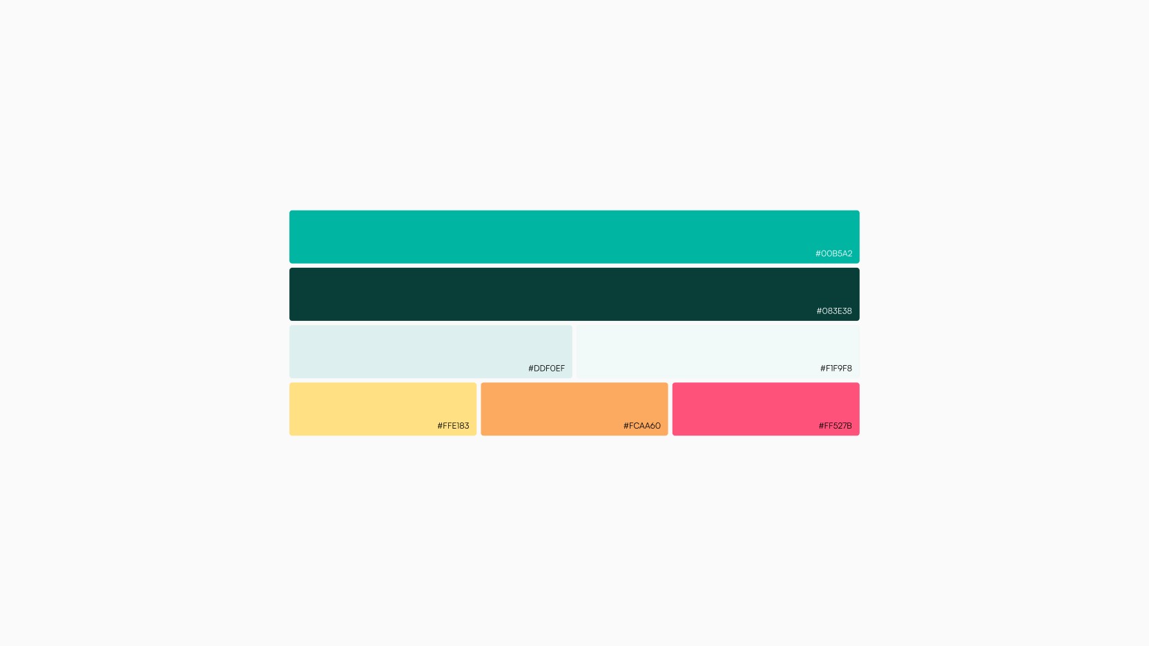
Colour palette
Greens taken from the water and the canopy, with high-contrast accents so hierarchy holds outdoors.
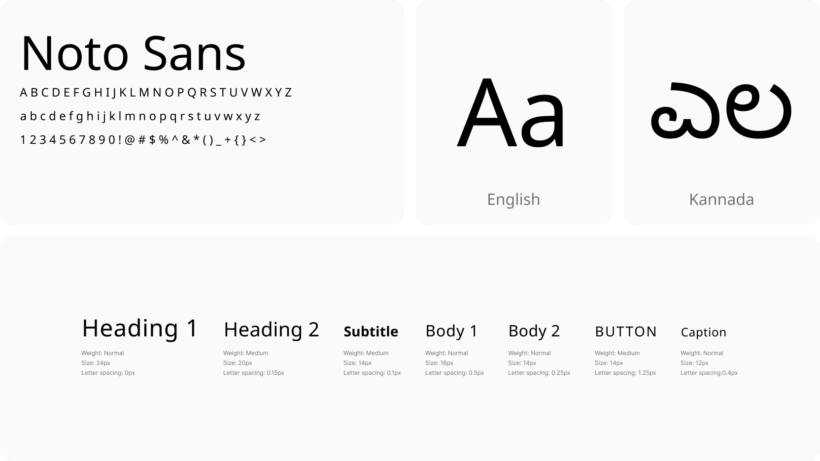
Type in two scripts
Noto Sans, so English and Kannada sit at the same weight and the layout does not shift between them.
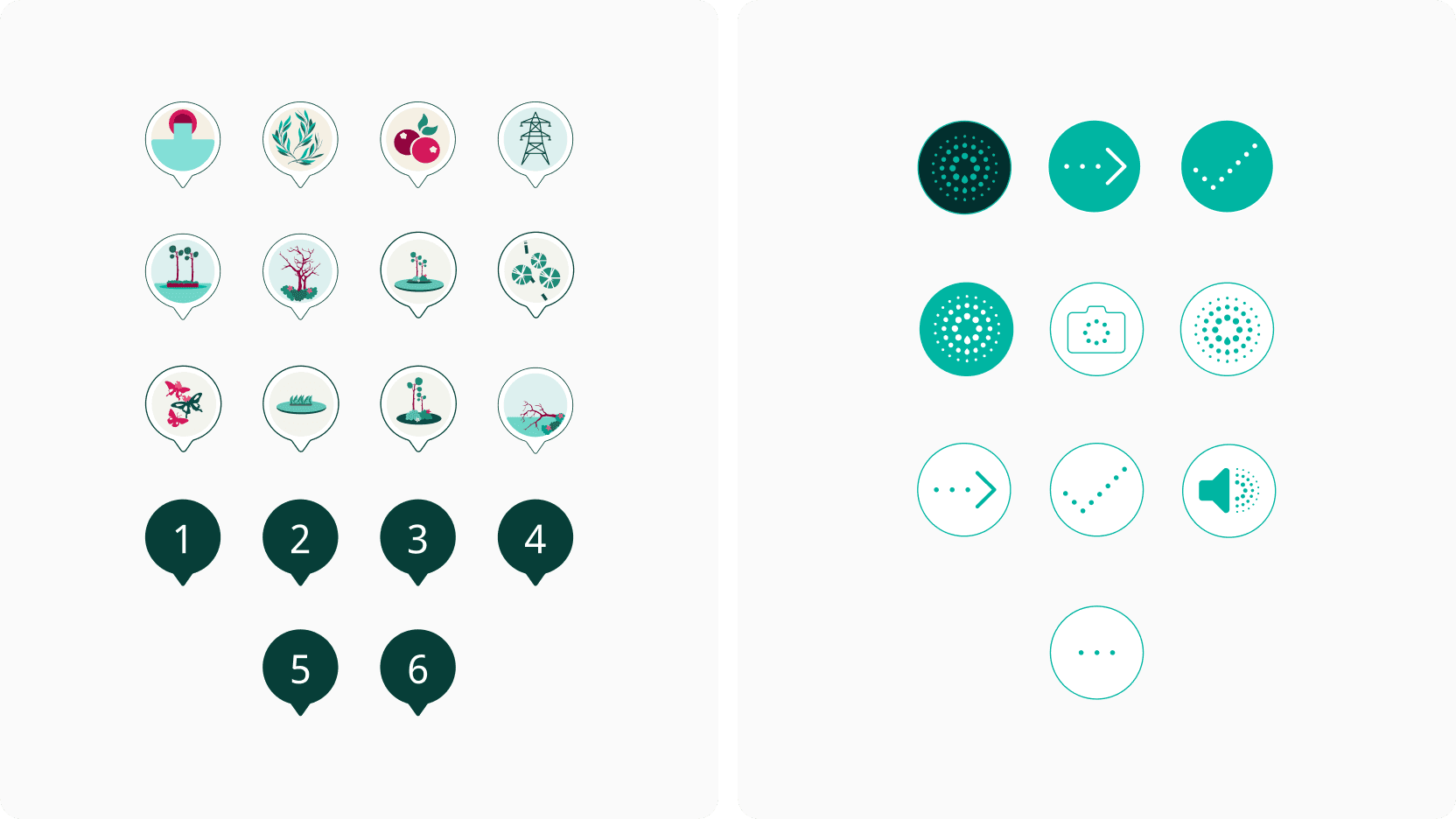
Icons instead of labels
Buttons that carry meaning without words, so one screen works in either language.
The screens, and how they move
With the language settled, the flows the stakeholder sessions had asked for: get oriented, take a walk, understand the water.
Get oriented, take a walk, understand the water.
The home screen
Mira sits at the bottom of the screen and wakes on interaction; live location keeps you on the path.

Other lakes and the profile, one tap from the home screen
Location-based tours, pinned to the flora and fauna along the path
Language switch, reachable from every screen
The assistant sits within thumb reach
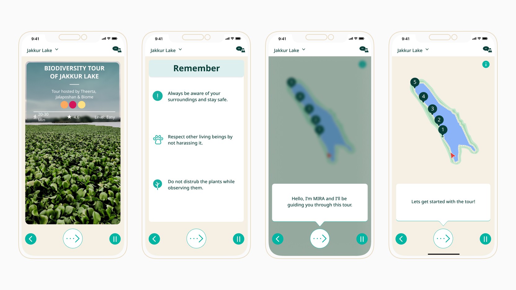
Onboarding
Language first, then a short pass through the four features.

The first tour
A nature tour is an unfamiliar idea, so the first one explains itself as it goes.
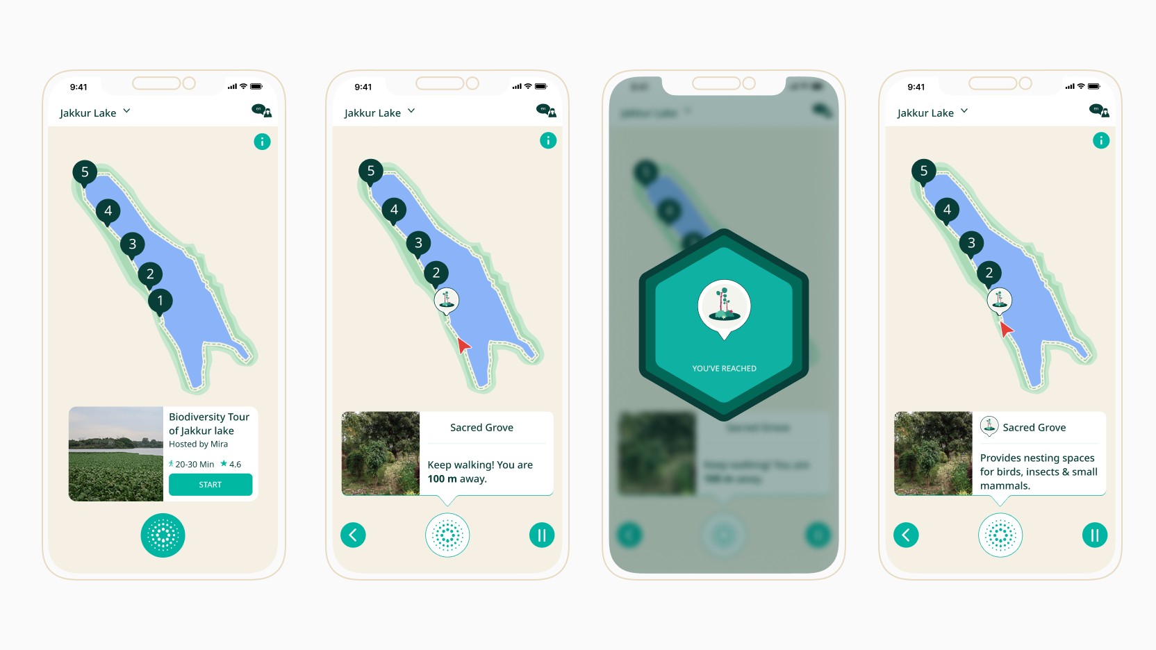
Milestones along the walk
Milestones sit at real places on the lake. Reaching one opens whatever there is to do there.

Reading the water
Nitrates and dissolved oxygen, turned into cards that say what the number means.
The things that make it feel like a guide rather than a form, and the checks on whether it works for the people who actually turn up. Small animations mark what worked, and give Mira a presence on screen.
Built for whoever shows up
Two languages, and enough visual guidance that neither is a requirement. Icons and imagery carry the app for someone who reads little of either script.

The app was reviewed outdoors across all three lakes, with two morning visits and one evening visit. Morning visits also revealed a useful product detail: bird activity was more visible earlier in the day, so the tour experience included a suggested best time to visit.
-
Walking mode, stripped back
The stretch between milestones is where a phone competes with the lake, and the lake should win. On that stretch the interface drops to essentials only, set bolder, so a glance is enough and nothing invites a scroll.
-
Kannada readers reviewed the interface
Two readers went through the translated app, with help from Kannada speakers on the team. They caught labels that were correct as translations and meaningless in context, which is the failure automated translation cannot catch.
-
Colour contrast
Checked, but honestly not a priority at MVP. The palette is close-toned by design, which makes it the first thing to re-audit if the app is picked up again.
-
Outdoor conditions
The experience was reviewed at all three lakes, across two morning visits and one evening visit. Morning observation also revealed that birds were more visible earlier in the day, which led us to add a suggested best time for the tour.
-
Accessibility scope
Screen-reader support, dynamic type and more detailed tap-target work were not part of the MVP because of time constraints. They would be priorities for a subsequent iteration.
Taking it to the lake
Then we took it outside. Testing the experience at the lakes helped us understand how people actually used it in context, and exposed a bigger comprehension problem: seeing lake statistics was not the same as understanding them.
-
Eight people, across all three visitor types
Five casual visitors, three of them children, plus two volunteers and one lake steward. The children were the useful surprise: a tour that survives a distracted nine-year-old survives most adults.
-
On a working build, not a prototype
Tested on installable APK builds rather than a clickable prototype, so what people experienced was the real product in the real environment.
-
Two rounds
Both against working builds, with the second checking whether the changes from the first had taken.
-
Tasks
Start a biodiversity tour and complete it unaided; tell me whether the water is healthy today; work through the SoWhat card and say what the reading means.
-
At the lake, repeatedly
Every session happened at the lake rather than in a room. We observed people who had not built the app try the experience in context, while the team also checked that the core tour flow worked end to end.
Testing also showed that lake statistics were understandable at a glance but not necessarily meaningful to someone without a scientific background. Terms such as nitrate and dissolved oxygen needed interpretation, not just presentation.
| Finding | What changed |
|---|---|
| People could read the lake statistics but did not understand what terms such as nitrate and dissolved oxygen meant. The information was too technical for people without a scientific background. | We introduced SoWhat cards: illustrated explanations, simple graphs and a rating/feedback step to help people interpret the data rather than simply read it. |


Outcome & Learnings
The app is open source and maintained by a civic group, so the deliverable was never just screens. It was a set of patterns someone else could extend without asking me.
The Figma file and library, components, design tokens, specifications, interaction documentation, Lottie files and prototypes. Two of the tours running in the app today were built by residents on top of that, which is the part I am most pleased with: the patterns held without me.
Key learning
- Sensor data only becomes useful when it is tied to the moment and place where someone meets it.
- Designing in two scripts is a layout problem before it is a translation problem.
- An experience used while walking has to work in glances.
What I would do differently
- Ship and test feature by feature rather than waiting for the whole MVP.
- Instrument analytics before launch so impact has a baseline.
- Design for where people are, not only for how it behaves on a screen.